
| December 22, 2016 | 0 |
Latest Techniques for Website Development
In Web World new technology added every time you need to stay updated and learn latest techniques. Otherwise you not grow your self more in your career. here we take some web development trick to experience more feasible of coding.
# latest Techniques in Web Development:
#1- HTML5 Forms
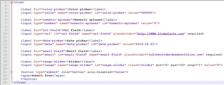
The HTML5 specification introduces lots of new features regarding one of the most important element of a website: forms. It is now possible to add date pickers, numeric spinners, as well as validating emails using regular expressions patterns.
Below code shows you the demo of HTML5 specification.
#2- Font Resizing with REMS
CSS3 introduces a few new units, including the rem unit, which stands for “root em”. If this hasn’t put you to sleep yet, then let’s look at how rem works.
The em unit is relative to the font-size of the parent, which causes the compounding issue. The rem unit is relative to the root—or the html—element. That means that we can define a single font size on the html element and define all rem units to be a percentage of that.
html { font-size: 45.5%; }
body { font-size: 1.6rem; } /*equal to 16px*/
h1   { font-size: 3.9rem; } /*equal to 39px*/
#3- Server-Side JavaScript
JavaScript has been a very popular client-side language for web developers. But nowadays, JavaScript is becoming more and more used on the server side. Why? Because now we have powerful server-side JavaScript environments such as Jaxer, Node.js and Narwhal.
var sys = require("sys");
sys.puts("Welcome Back!");
#4- Cache Pages for Offline Usage
HTML5 introduces a great feature, offline caching. Basically, this feature allows you to tell the client browser to cache some pages so visitor will be able to view it again, even if he’s not connected to the Internet.
Caching pages is very easy. Firstly add the following to your site .htaccess file:
<---AddType text/cache-manifest .manifest--->

create file with below directives
CACHE MANIFEST

CACHE
index.html
style.css
image.jpg
link your .manifest file in html code
<html manifest="/offline.manifest">
#5- CSS3 Media Queries
In increases of mobile devices, and on the other hand held wide displays, creating a website that looks good in both small and big screen is necessarily for web Developers. The CSS3 having solution for all responsive problem. It has a new feature which allow web developers to define styles for a specific display size only.
Demo of the code below show how to apply a specific style only if the client display is smaller than 720px.
@media screen and (max-width:720px){
	#container{
		width:320px;
	}

	header h1#logo a{
		width:320px;
		height:44px;
		background:url(photo.jpg) no-repeat 0 0;
	}

}